Lighting Ideas/Concerns for Act 3

Submitted by Molly M. Doyle on Friday, 2/19/2010, at 12:41 AM

Sorry for the interspersed postings, I just have a few reactions to other peoples posts.

I second Jenna in that I would love to have either paper or petals on the ground for Act 4 (and I would personally volunteer to be the crew member that sweeps up the paper/petals each night!)

Also, I love the night-time blue/grey lighting of Michy's painting for the third act. I think the main challange of lighting the third act will be to maintain the night setting and mood while still lighting the individual singers well enough so that we can read their faces.  I vote that we use more lavender tinted filters for this scene because the Stage Lighting Handbook says that lavenders are "particularly sympathetic to faces" and work well with other lights in that they can appear warm or cold (82). Also, it says we should avoid blues with green content because they can be unflattering for the actors. I know we have spotlights that we'll probably end up using a lot, but I think they can be kind of harsh sometimes (depending on how dark the rest of the stage is and what the singer is standing in front of) and I believe we only have two spots (which would pose a challange when, for example, we want to light Carmen, Don Jose and Michaela all at the same time.) 
 

Submitted by Henrik O. Onarheim on Thursday, 2/18/2010, at 9:55 PM
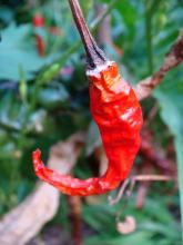
There was a piece of slightly shriveled piece of chili in an olive oil sauce for bread that I had while eating out last night, and it really made me think of Carmen. First of all, the flaming red of a chili stands out, but something also about the texture has me thinking of the opera. Not fully certain why...
Submitted by Henrik O. Onarheim on Thursday, 2/18/2010, at 9:53 PM
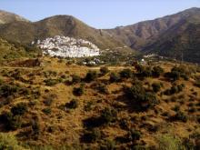
I really agree with Molly about the lighting, and have been picturing the same thing. In addition to the bright, humid lighting, I also picture a sense of vastness, especially in the first act. This image sort of shows that as well as the parched and rugged nature that is found in Andalucia.

Act 1 Lighting

Submitted by Molly M. Doyle on Thursday, 2/18/2010, at 6:49 PM
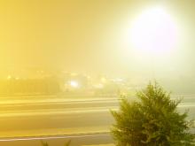
I've been trying to think about the quality of lighting that would fit for the different locations, and I think this picture shows the hot, humid, diffuse yellow tone that I picture for the first act.

Don Jose Pics

Submitted by Mark Santolucito on Thursday, 2/18/2010, at 5:59 PM
some ideas about the kind of characters they are.

carmen pics

Submitted by Mark Santolucito on Thursday, 2/18/2010, at 5:59 PM
some ideas about the kind of characters they are.

Interview about Met production and set

Submitted by Molly M. Doyle on Wednesday, 2/17/2010, at 12:46 AM

I'm not sure if this exactly belongs in the "Design Worlds" section of this site, but I thought it might be relevant to how we think about our own designs. This is an interview with the director of the Met production, Richard Eyre:

http://www.youtube.com/watch?v=on-3SSavtU4

Starting at 1:24 he begins to talk about Rob Howell's set designs and the ideas behind them. (There are also some really neat computer models of the set.) I'm not suggesting that we copy the Met's set, but I really like what he has to say how the design is intended to give us a sense of a "fractured society." How might we be able to incorporate our own feelings about the opera (and the sense of "desire" that we've been discussing) into a visual metaphor?