For Amherst College Website Editors
Updated June 4, 2023
Accessible webpages benefit everyone. The more accessible your content is, the more user-friendly it will be to all people, whether they’re reading the page on a large screen or on a cell phone, or hearing the page read aloud by a screen-reader. This guide provides tips for making your web content accessible.
Tabbing vs. Mousing
At any given time, some of a website’s visitors will be using a mouse or trackpad; some will be using a touchscreen; and some will be using a keyboard only. For this reason, Amherst College’s website provides specific features to facilitate keyboard-only navigation. College editors adding content to the website should also keep keyboard navigation in mind, and can test pages by using the tab and up and down arrow keys to move through a webpage. Start by placing your cursor in the browser’s address bar, at the end of the URL, and clicking the tab key.
To make your page more keyboard-friendly:
- Reduce clutter. Busy pages can be cumbersome to navigate via keyboard.
- Avoid repetition and unnecessarily long text.
Screen-Reader Accessibility

People who are blind or have low vision often rely on screen-readers to read webpages. Screen-readers translate pages into plain text, which is either read aloud by a voice synthesizer or output to a Braille device. When taking in a whole page visually, people may prioritize the content using visual guideposts of type size, type formatting, the prominence of graphics, and other visual cues, and experience the content in a holistic manner. People using screen-readers may tab through a page, one element at a time, to experience the content in a linear manner or may utilize text-based guideposts of lists of headings, links, and page regions for a holistic understanding. Thus, you’ll want to organize and format your content so that it makes sense both holistically and linearly and incorporates useful visual as well as textual guideposts.
Here are some ways to make pages friendlier to screen-readers, and easier for the person going through your page one word, one image at a time.
Language and Structure
- Avoid “click here” links or vague link names. Screen-reader users often use a keyboard shortcut to list all the links on a page. In such a list, the links have no surrounding text, so it’s important to make your link names descriptive.
- Instead of “Click here to learn about Amherst’s president’,” say “Learn about Amherst’s president.”
- Reduce clutter. Busy pages can be hard for anyone to read, but they can be especially confusing and cumbersome to someone using a screen-reader.
- Use headings (Heading 2, Heading 3, and so on). A person who can’t see your headings can’t discern their relationship to surrounding content based on visual cues such as type size (does this heading refer to the whole page, or to this subsection?). To structure your information hierarchically, use headings.
- Don’t manually format bulleted and numbered lists. Instead, use the bulleted and numbered list options in the website editing menu. This will help screen readers to identify and translate the lists correctly.
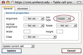
- Use tables selectively. Please use tables only when you need to present information that needs corresponding columns and rows, such as a chart. When creating a table, be sure to use “header” cells where appropriate (usually the top row and left column).

Images
When a screen-reader encounters an image, it will say “graphic” or “image” and then read the image’s alternative (“alt”) text.
- Include descriptive alt text for all images, describing the image specifically but briefly.
- If you must use an image that has a lot of text in it, repeat the text in a caption below the image.
- Read the WebAIM guide, Appropriate Use of Alternative Text.
Forms
Forms created in PDFs or Word documents will vary in their accessibility. Use a webform or Google form, instead.
PDFs
PDFs are frequently inaccessible. Please post your content as a regular webpage, instead.
Try out our Formatted Article with Image display option for an easy way to make a presentable and professional webpage in lieu of a PDF.
Statistical Charts and Infographics
Infographics and charts can be useful visual aids. But please keep accessibility in mind. You can try two options:
- Translate the chart or infographic into an HTML table (properly formatted for accessibility — see above). This might require breaking up the images and text in order to fit them into separate table cells.
- Convey the meaning of the chart or infographic in a caption below the image.
Color Contrast
Our website has accessible color contrast built in, so you don’t need to do anything special when creating webpages. But if you’re posting a graphic with text in it, be sure to make the text colors high in contrast.
Digital Documents
Creating a Word doc, PowerPoint presentation, or other document? Please see IT’s guide to creating accessible documents.